In drawing trendlines on candlestick charts, we also have the option of drawing them
from the highs and lows of the wicks or from the highs and lows of the bodies.
More often than not a trading range proves to be a price pause before
resumption in the same direction in which the market was
moving before entering the range. This occurs because markets
tend to trend more than they reverse.
We do this by waiting
for an individual candle to close and then updating our trendlines
if necessary before committing to a direction or trade
We always trade from the perspective that we do not know
whether the level will hold. We do not try to guess whether
the level will hold; we stay patient and let the market tell us if
it is respecting the potential support or resistance. Remember
to “lose your opinion, not your money.” Once the candle is
closed, we get a true snapshot of its behavior.
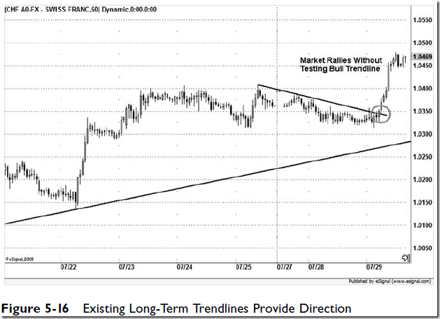
Trendlines are very useful for pointing out direction. Price
doesn’t have to go up to the trendline and give us a textbook
trigger every time. In many cases just having the trendline in
place on the chart will provide a reminder of a market’s current
direction.
In a flat or sideways
environment the market will tend to wrap around its
central pivot, using pivot support 1 (S1) for support and pivot
resistance 1 (R1) for resistance. In an uptrend price often
tends to respect the central pivot or S1 as support and R2 as
resistance, whereas in a downtrend price tends to respect the
central pivot or R1 as resistance and S2 as support.
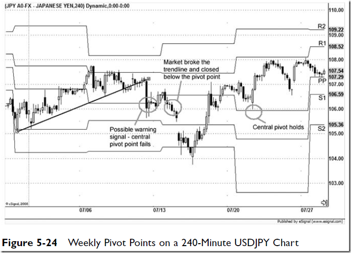
The chart in Figure 5-24 gives us
a hint that a correction may be coming. On this 240-minute
USDJPY chart we see that the market failed to clear R1 three
times and then fell quickly and sliced through its weekly
central pivot on July 11, which was a clear warning sign. It
struggled to get back above that central pivot the next week,
giving traders a chance to exit longs or initiate shorts, before
falling sharply again. After falling too far too fast without even
pausing at S1, the market made a complete recovery ahead of
the weekend. The next week it started to sell off again early in
the week of July 20, only to retest that weekly central pivot,
which held, before moving ahead to post a higher high.
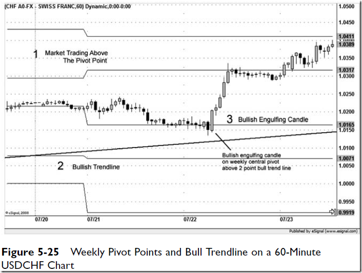
Figure 5-25 shows an example of a buy signal in the form of
a bullish engulfing candle, right on the weekly central pivot of
this 60-minute USDCHF chart. Not only does the market trading
above the weekly pivot tell us that the market is exhibiting
underlying strength, the bullish trendline tells us that the market’s
current direction is higher. The candle clears the high of
the last dozen or more candles, providing a further indication
that the buy signal could be a generous one.
Figure 5-26 shows a session in which the market opens
above the daily central pivot. We also can see on the far left that
on the previous day the British pound challenged R2, which
indicates a strong market. For the session on May 21 we see the
market trade down to test the central pivot and then give us a
bit of a bounce to tell us it respects the pivot, followed by a
retest with an actual close below it, before a change-of-direction
candle and a close above the central pivot, followed by a
nice rally.
A question you may be asking yourself is, “How do I know
which pivot point to place importance on: the monthly, weekly,
or daily pivot?” The answer is that the time frame you are trading
is the pivot point you are going to be watching. If you are
position trading by using the daily chart for entry and exits,
you are concerned with only the monthly pivots. For trading
between a 60-minute and a 240-minute time frame, you follow
the weekly pivots, and for day trading, you use the daily
pivots. If you are in a trade on a lower time frame and the market
outruns the appropriate pivot points, you can consult the
next higher time frame’s pivots.
pivots are a trend-following tool in that they expand and contract on the
basis of previous market behavior.
Figure 5-33 shows the same day we just examined, but on
the next lower time frame. Here we again see a change-ofdirection
candle, this time on the 60-minute chart. Of course
we don’t know at the time that this intersection of a trendline
and a 0.618 percent retracement will hold, but when we see the
change-of-direction candle put in the double bottom here, just
below 104, we don’t think, we buy.
Although Fibonacci retracements are more of a countertrend
tool in that they measure primarily corrective price behavior,
Fibonacci extensions are a trending tool because they are

Figure 5-36 shows a late summer rally in 2007 in GBPUSD
and then a sharp correction lower by approximately 66 percent
of the up move into mid-September, which provides a retracement
from which to draw an extension higher. In this case the
market pulls up short of the 100 percent extension in early
October and proceeds to move sideways for much of the
month before slipping higher toward the end of the month. The
second close above the 100 percent extension proves to be a
“breakout” above both that level and the isolated high back in
July, and we get a very fast rally, or a climax rally, up to the
1.618 extension level.
there are plenty of
levels for traders to be concerned about on a chart, but the
most important thing to remember is that we don’t respect the
level unless the market does that first.
Technical analysis is, after all, an art and
is based on the assumption that “the charts tell us everything
the market knows about itself.”
In markets we often see an
orderly price move to establish direction, then acceleration
on increasing volume, followed by a dramatic sell-off.
These formations are characteristically larger than flags and
take more time to develop. As in any breakout, we must wait
for the candle to close outside the formation.
We are going to cover reversal patterns next, and it’s important
to remember that these topping or bottoming patterns are
not nearly as common as continuation patterns. A word of caution
is due in addressing reversal patterns, particularly on long term
charts, because they occur less often. There is something in
human nature that makes us feel we need to change things for
the better. Beginning students imagine that they can discern a
change in the market before the rest of us and call a market top
or bottom and maximize their profits along the way. Experienced
traders know better and are more interested in going
along with the market, which means trading through more continuation
patterns than reversal patterns. It is best to understand
this human tendency to change things at the very beginning of
a trading career. The only thing we need to change as traders is
our perceptions of our significance in the face of the market.
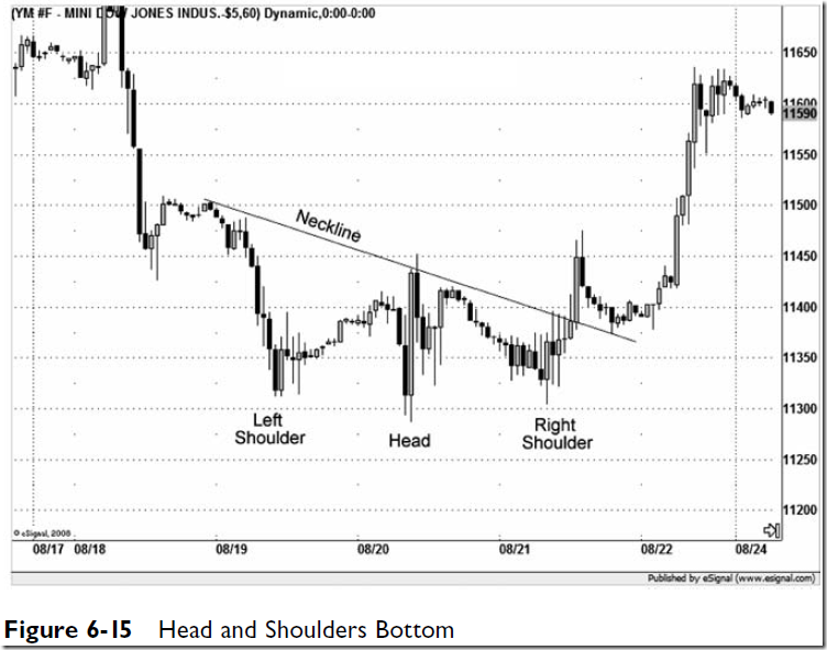


A rising wedge is a bearish formation that usually is seen as a
reversal pattern but also can be a continuation pattern. Here we
will focus on reversal patterns. A rising wedge can be seen on
the charts as an up move with a wide shape that gradually
narrows as it rises, giving it a cone shape. It can be tricky to
identify as being bearish because it exhibits the higher lows and
higher highs that are the hallmark of an uptrend. What helps
us identify it as a reversal formation is the decreasing volume
on each successive rally.
Despite what most analysts believe, technical indicators were not designed to predict future price movement as much as to define current price movement. It is believed by most experienced money managers and traders that the simplest formulas often lead to the most successful trading.
Most leading indicators measure
momentum, or the degree of the slope of a current price movement—
i.e., the speed of the trend—and are called momentum
oscillators.
It is thought
by many experienced traders that the most important skill a
trader can have and the one that is the hardest to achieve is the
ability to “let a profit run,” or stay in a position longer and maximize
profits. Two of the main reasons for this are emotions,
generally nervousness, and leading indicators. Trend traders
need to be comfortable with lagging indicators.
In Figure 7-3 we have an 89-period and a 144-period EMA
cross that generates a sell signal on the daily chart. 6 month drawdown

although the zero line cross by the black line is still the most
influential signal because it is a trending signal, we also have
the MACD-trigger line cross, which can be both a trend signal
and a countertrend signal.
MACD Histogram
The rate of change between the two lines (the MACD and the
trigger line) also provides an indication of the strength of a
move.
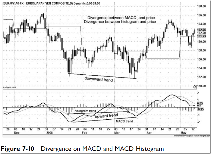
Traders often ask, “Which divergence should we look for,
that between the MACD cross (the black and gray lines) and
price or that between the MACD histogram and price?” The
answer is either one; however, short-term divergence generally
will show up first on the histogram and can be more significant.
By coupling a shorter time frame EMA that has
smaller deviations with an 18-SMA that has a 2 standard
deviation Bollinger band, we may be tipped off sooner
that a desirable setup is in the making.
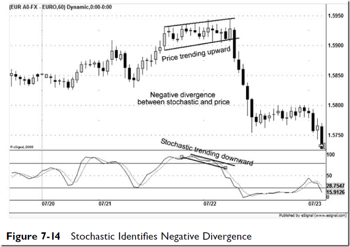
Because
a stochastic is so sensitive, it is a good indicator to use for signal
generation that gets you in quickly.
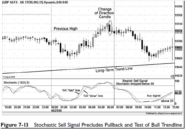
Some traders also use a stochastic in their short-term trading
by taking a close above 70 as a buy signal and a close below
30 as a sell signal. This may seem counterintuitive initially but
can work well in identifying markets that are accelerating.
Another way to use the signal is to wait for a second cross
down from the upper level or a second cross up through the
lower level before entering a position. The stochastic is a sensitive
indicator, and by seeking out markets in which it gives
that second cross for a signal, it is thought that a trader can
help increase the odds of success on a trade.
It is rare to see an RSI reading above 80 or
below 20, but when those numbers come, they are significant.
A reading below 20 generally indicates that a lower low in
price is still to come, and a reading above 80 almost always
means that a higher high in price is to follow.
Just
as we can draw trendlines that act as support and resistance
on the price chart, we can draw trendlines on an RSI chart that
may act as support and resistance.
the
majority of CCI values would fall between 100 and -100. When
the market moves above 100, it is thought to be entering
an uptrend and a buy signal is given, and when the market
moves below the -100 CCI reading, a sell signal is generated.
Similarly, a move up through -100 would be seen as a countertrend
buy signal, whereas a move down though 100 would
be seen as a countertrend sell signal. By not considering price
action between the 100 and -100 levels, the trader avoids much
of the sideways or countertrend price action and seeks out
the times when markets enter into cyclical moves.
Assuming that a quarterly cycle is a good fit
for a currency, we went with a 20 length CCI in this example.
Figure 7-17 shows how a CCI trendline
signal followed by a move above 100 provided timely buy
signals in USDJPY.
The reading on this chart for February 1 is
0.0237, which tells us that the ATR over the previous 14 sessions
was 237 pips. Therefore, we can surmise that if we take
a position in this market and want to place our stop far
enough away from price to avoid being stopped out on a random
intraday price spike, this information will be helpful. We
may decide that a 2 ATR stop would be appropriate—placing
our stop over 474 pips away from our entry—in that it would
give us enough room to stay in the trade and not have to
worry too much about price stopping us out prematurely.
That will help us determine how
much we would need to expect to risk or if we could even
afford to take a position in that market.








No comments:
Post a Comment